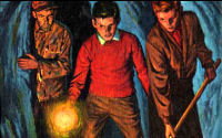

Front cover design (Canon)
When the Hardy Boys series began in 1927, the books were bound in a plain cloth cover, with cover art printed on the paper dust jacket. In 1962, Grosset & Dunlap dropped the dust jackets and switched to the more durable "picture cover" format, in which the cover art was printed directly on the book's cover. Aside from their physical construction, the graphic design of the covers has also changed over the years, as described on this page.
Two important notes:
- All dates below refer to the date when the cover was originally designed, not the printing date. So, for example, a cover that was designed between 1927 and 1931 will use Format 1, even in post-1931 printings.
- In the mid-1970s, all covers that were still in print (which encompassed formats 5 through 9) were modified by the addition of a volume number, as discussed near the end of this page.
NEW: Just for fun, check out these modified covers of The Tower Treasure illustrating cover formats 4-10 (as listed below), and this gallery of hypothetical Canon covers in the Wanderer arch style used on volumes 59-82 of the Digests.
Format 1 (1927-1931)
Sample of Format 1
Description
- "THE HARDY BOYS," in hand-painted italic serif lettering, is centered, with a thin line directly beneath.
- The book's title is in hand-painted block sans-serif lettering, usually red with a black outline. Its alignment varies to fit the cover illustration.
- The author's name is at the bottom of the cover, usually in the same style of lettering as the title.
Usage
This format is found on the original covers of volumes 1 through 10, as well as on a revised 1933 version of the 1927 cover of The Tower Treasure.
Examples
 #1, 1927 |
 #2, 1927 |
 #4, 1928 |
 #5, 1928 |
 #7, 1929 |
 #8, 1929 |
 #9, 1930 |
 #10, 1931 |
Format 2 (1932-1936)

Sample of Format 2
Description
- "THE HARDY BOYS," in hand-painted sans-serif lettering, is centered. (Except in the 1934 cover of The Mark on the Door, in which it appears below the title, left-aligned.)
- Various styles of hand-painted lettering were used for the title, ranging from the narrow lettering used for Footprints Under the Window to the wide, decorative lettering used for The Sinister Sign Post.
- The author's name is at the bottom of the cover, in block sans-serif lettering.
- Various lettering colours are used, coordinating with the cover's colour scheme.
- Cover illustrations are in a colourful art deco style, in contrast with the more realistic style used before and after this period.
Usage
This format is found on the original covers of volumes 11 through 15.
Examples
 #11, 1932 |
 #12, 1933 |
 #13, 1934 |
 #14, 1935 |
 #15, 1936 |
Format 3 (1937-1945)

Sample of Format 3
Description
- "THE HARDY BOYS," in hand-painted script lettering, is centered. Usually in red, white, or yellow.
- The title's lettering and alignment varies, but hand-painted block sans-serif lettering in yellow, red, or white is usually used. Function words ("of", "the", etc.) sometimes appear in smaller script.
- The author's name is at the bottom of the cover, in various styles of hand-painted lettering. Sometimes it is broken into two lines.
Usage
This format is found on the original covers of volumes 16 through 24. As well, new covers for volumes 1 through 9 were released in this format.
Examples
 #18, 1939 |
 #19, 1940 |
 #21, 1942 |
 #22, 1943 |
 #1, 1944 |
 #2, 1944 |
 #6, 1944 |
 #8, 1944 |
Format 4 (1946)

Sample of Format 4
Description and usage
This format, which, except for the typeface, is the same as Format 5, was used only once: on a new 1946 cover for volume 10, What Happened at Midnight. The typeface used is Lydian:
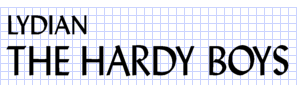
Although this was Lydian's only appearance on a Hardy Boys cover, it was subsequently used for many Nancy Drew books of the period.
This format marked a significant change in Hardy Boys cover design: on all previous covers, the lettering was painted by hand, but from this point on, it was set in a typeface.
Example
 #10, 1946 |
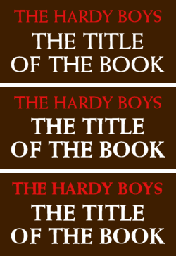
Format 5 (1946-1965)
Variants of Format 5
Description
- All elements use the same dignified serif typeface, Weiss (including, in later years, Weiss Extra Bold):
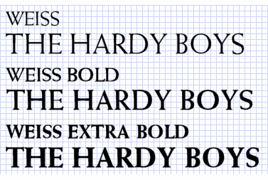
- Originally, the lightest weight of Weiss was used (format 5a), but in the mid-1950s there was a gradual switch to Weiss Extra Bold (format 5b). Although the change was slight, one telltale difference between the two weights is the shape of the "W".
- "THE HARDY BOYS" is aligned right, left, or center. It's usually red or yellow.
- The title's alignment varies. It's usually coloured white or black, and function words are occasionally a smaller size.
- The author's name is smaller than in other formats -- just over half the width of the cover. It's usually located on one line at the bottom of the cover. (The 1965 cover for Footprints Under the Window is an exception to this. "Franklin W. Dixon" is found on two lines, right-aligned just beneath the title. If the creators had placed the name at the bottom of the cover, it would have obscured the footprints.)
Usage
This was the longest-running cover format of the original series, and it's the oldest format that's still in print today. It was used on the original covers of volumes 25 through 44, as well as many new covers for older volumes:
- 1950: Volumes 11 through 15
- 1959/60: Volumes 1 through 9
- 1962: Volumes 11, 14, and 16 through 24
- 1964: Volume 6
- 1965: Volume 12
By 1962, all of the older covers had been replaced by covers of this format. (Except for What Happened at Midnight, which used Format 4, above, but it's arguable that Format 4 is a special case of Format 5.)
Examples of Format 5a
 #25, 1946 |
 #26, 1947 |
 #29, 1950 |
 #12, 1950 |
 #14, 1950 |
 #15, 1950 |
 #31, 1952 |
 #34, 1954 |
Examples of Format 5b
 #35, 1955 |
 #38, 1959 |
 #1, 1959 |
 #8, 1960 |
 #40, 1961 |
 #17, 1962 |
 #44, 1965 |
 #12, 1965 |
Format 6 (1966)

Sample of Format 6
Description
- The structure is the same as the previous format, but the typeface has been changed to the more modern-looking Optima:

- Franklin W. Dixon's name becomes even smaller.
Usage
New covers for volumes 27 and 37 were released in this format.
Examples
 #7, 1966 |
 #37, 1966 |
Format 7 (1966-1967)

Sample of Format 7
Description
- The next step in the evolution: thin horizontal lines are added above and below "THE HARDY BOYS." Besides that, it's the same as the previous format; the typeface is still Optima.
- "THE HARDY BOYS," always centered, is usually white or yellow, as is the title.
- The author's name is quite small. It's usually located at the bottom of the cover, sometimes on two lines instead of one. In the 1967 cover of The Mark on the Door, it's centered directly below the title, which foreshadows Format 9.
Usage
This format is found on the original covers of volumes 45 and 46. As well, new covers for volumes 10, 13, 17, and 21 were released in this format.
Examples
 #17, 1966 |
 #45, 1966 |
 #10, 1967 |
 #13, 1967 |
 #21, 1967 |
 #46, 1967 |
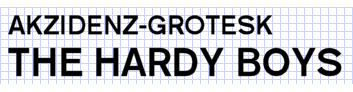
Format 8 (1968-1970)

Sample of Format 8
Description
- Once again, there's just a slight modification: the typeface is changed to Akzidenz-Grotesk (the ancestor of today's better-known typefaces Helvetica and Arial).
- Perhaps coincidentally, the variety of colours increases.
- On several of these covers, Franklin W. Dixon's name isn't spelled in all caps -- a first for a Hardy Boys cover.
Usage
This format is found on the original covers of volumes 47 and 48. As well, new covers for volumes 15, 18, 23, 25, and 29 through 32 were released in this format.
Examples
 #15, 1968 |
 #30, 1968 |
 #47, 1968 |
 #18, 1969 |
 #25, 1969 |
 #32, 1969 |
 #48, 1969 |
 #23, 1970 |
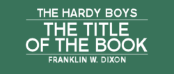
Format 9 (1970-1974)
Sample of Format 9
Description
- For the first time, "THE HARDY BOYS," the title, and the author's name are all incoroprated into a single unit. The Akzidenz-Grotesk typeface is retained from the previous format.
- "THE HARDY BOYS" is centered at the top. A thin horizontal line separates it from the title, centered below it. The author's name appears beneath the title, again separated by a thin horizontal line.
- All elements are the same colour: either black or white.
Usage
This format is found on the original covers of volumes 49 through 53. As well, new covers for volumes 20, 21, 22, 26, 28, 33 through 36, and 38 were released in this format.
Examples
 #20, 1970 |
 #26, 1970 |
 #28, 1970 |
 #49, 1970 |
 #22, 1971 |
 #51, 1972 |
 #38, 1973 |
 #53, 1974 |
Note: Around 1970, cover artist Rudy Nappi introduced a new concept for his cover illustrations. Instead of depicting a specific scene, his new illustrations contained a montage of different elements from the book arranged on an abstract background.
Format 10 (1975-1979)
Sample of Format 10
Description
- A slight alteration of the previous format, incorporating the volume number, which appears to the left of "THE HARDY BOYS."
- Presumably to visually separate them, a box is drawn around the number and "THE HARDY BOYS."
Usage
This format is found on the original covers of volumes 54 through 58.
Examples
 #54, 1975 |
 #55, 1976 |
 #56, 1977 |
 #57, 1978 |
 #58, 1979 |
Changes made to existing covers
Addition of volume numbers
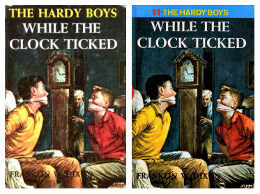
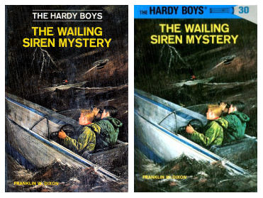
Around the time that Format 10 was introduced in 1975, the volume number was added to the covers of all previous volumes as well. In most cases, the number was simply placed to the left of "THE HARDY BOYS", as illustrated in this before-and-after shot of volume 45:
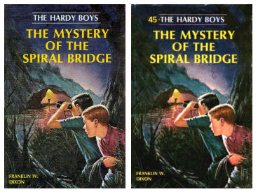
In certain cases, particularly if there was not enough space available to insert the number, a blue bar was placed over the existing "THE HARDY BOYS". The volume number, along with a new "THE HARDY BOYS", was printed on this blue bar. Volume 11 is one such case -- the original lettering filled the top line, leaving no space to insert a number, so the blue bar was necessary.
Addition of flashlight header
With the introduction of laminated covers in 1987, the above idea was generalized to all volumes. A blue bar containing "THE HARDY BOYS" and the volume number (now illuminated by a flashlight) was superimposed on the top of every cover in the series:
Although the typography of the flashlight header clashes somewhat with the older covers, particularly those of Format 5, one can imagine that the publishers were unhappy with the previous inconsistency of the cover design, as some covers were topped by a blue bar and others were not. The flashlight headers brought a consistent design to the entire series.