

Spine design (Canon)
For those of us who keep our books on bookshelves, the spine is by far the most frequently seen element of a book's exterior design. The spines of the Hardy Boys canon have undergone a rather complicated evolution over the years, which this page attempts to document in detail. The description is divided into three sections:
- Dust jacket (DJ) spines (1927-1962)
- Picture cover (PC) spines (1962-1987)
- Laminated "flashlight" spines (1987-present)
Dust jacket (DJ) spines (1927-1962)
Sorry, I haven't written this section yet!
Picture cover (PC) spines (1962-1987)
When the books were switched to pictorial cloth covers in 1962, the wrap spine was abandoned in favour of a uniform blue background. These blue spines, which were used until the switch to laminated covers in 1987, all share the following elements:
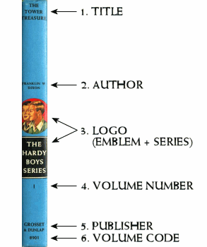
In broad terms, all PC spines shared this same format. However, most of the above elements underwent a few minor formatting changes over the years. In the following, the details for each element are described in turn. Note that in general, whenever a new front cover was created (e.g. for a revised edition), a new spine was also created. Each different front cover design therefore has its own corresponding spine design.
1-2. Variation in the title and author
The title and author are generally set in the same typeface that is used on the cover. We can see this correspondence clearly by comparing the three PC editions of volume 21. In each case, the spine and the cover both use the same typeface for the title and author.
Volume 21, first PC edition, 1962: Weiss typeface used for cover and spine (Cover format #5b)

Volume 21, second PC edition, 1967: Optima typeface used for cover and spine (Cover format #7)
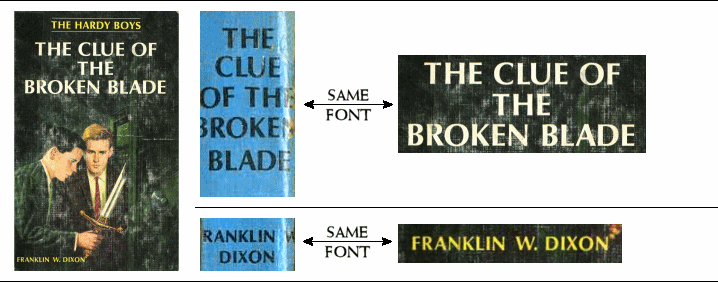
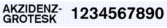
Volume 21, third PC edition, 1970: Akzidenz-Grotesk typeface used for cover and spine (Cover format #9)

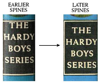
3. Variation in the logo
There is a minor variation in the black rectangle that contains the name of the series. The original format is a holdover from the design of later wrap DJ spines, which placed the volume number on the last line of the box, as in the following image from the DJ of volume 39:

In PC editions, the volume number was removed from the box, thus leaving the last line of the box empty. This blank line was rather awkwardly left in place in some earlier PC editions, as in the first image below. Eventually, however, the design was cleaned up by vertically centering the remaining text, as in the second image.
4. Variation in the volume number
In general, the following dates refer to when the cover and spine were originally designed. Therefore, if the cover and spine were designed in 1962, for example, the spine number will be set in the Lydian typeface, regardless of when the book was printed. However, there is one major exception to this rule: in 1973, the format of the spine number was changed on all existing volumes. Volumes that were originally published before 1973 therefore have two different spines: an "old spine" found on pre-1973 printings and a "new spine" found on post-1973 printings. Keep this in mind as you read through the following section, as the first five formats all date from before 1973, so they will only be found on "old spine" editions; i.e., editions that were printed before 1973.- 1962: Lydian numbers. All covers that were first created in 1962 received spine numbers set in Lydian—the same typeface that was used on the 1946 cover of volume 10, as well as the covers of all Nancy Drew books from this period.
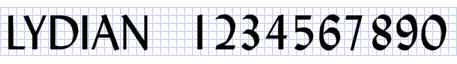
Volumes 1-40 were all converted from DJ to PC format in 1962, so all of these volumes received spine numbers in Lydian. So did volume 41, issued in 1962. Here are some samples of Lydian spine numbers:
The front cover design for all of these volumes was either Format 4 (which also used the Lydian typeface) or Format 5 (which used the Weiss typeface). - 1963-65: Weiss numbers. Covers that were first created in 1963-65 received spine numbers set in Weiss, the same typeface that was used in cover format 5 from 1947-1965.

Volumes 42 (1963), 43 (1964) and 44 (1965) received Weiss spine numbers, as did the revised editions of volumes 6 (1964) and 12 (1965).

The front cover design for all of these volumes was Format 5, which, as mentioned above, also used the Weiss typeface. - 1966: Univers Condensed numbers. Two covers created in 1966 received spine numbers set in a condensed sans-serif font, apparently Univers Condensed.

These numbers are found on volume 45 and the revised edition of volume 17.

The front cover design for both of these volumes was Format 7, which used the Optima typeface. - 1966-68: Futura numbers. Most covers that were first created in 1966-68 received spine numbers set in Futura.

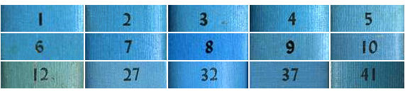
The front cover design for these volumes was either Formats 6-7 (which used the Optima typeface) or Format 8 (which used the Akzidenz-Grotesk typeface). - 1968-72: Small Akzidenz-Grotesk numbers. Covers that were first created in 1968-72 received spine numbers set in Akzidenz-Grotesk at a small point size.

The numbers for the revised editions of volumes 28 (1970) and 30 (1968), and also volume 49 (1970), are slightly different: they appear slightly more condensed and less bold, although they still seem to be a version of Akzidenz:

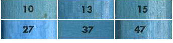
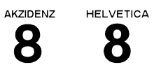
The front cover design for all of the above volumes was either Format 8 or Format 9, both of which also used Akzidenz-Grotesk. - 1973: Replacement by large Helvetica numbers. Around 1973, all of the above spines (encompassing volumes 1-51) had their numbers replaced by numbers set in Helvetica Bold at a noticeably larger size.

As confirmation that the typeface is indeed Helvetica rather than Akzidenz, compare the shape of the "2" character in the two fonts:
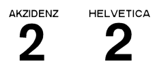
The sample numbers below clearly use the Helvetica "2", despite the fact that the front covers created in this period used Akzidenz.
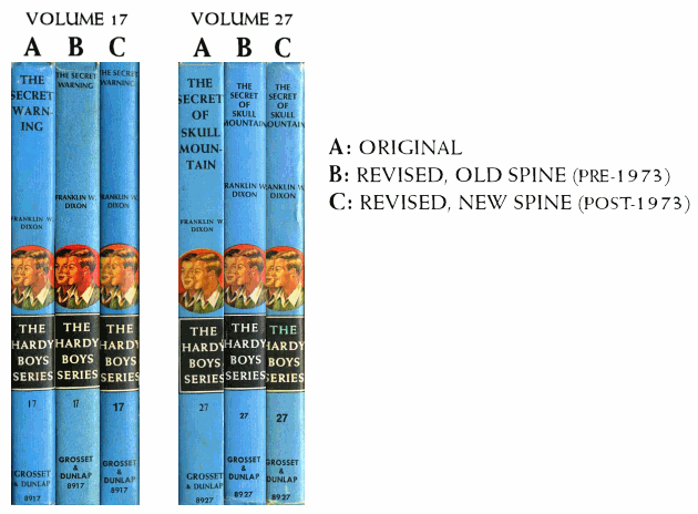
For volumes 1-51, this replacement means that there are at least two distinct PC spines: one with the "old number", from printings before 1973, and one with the "new number", from subsequent printings. For volumes 1-38, there is often also a third distinct spine, for the original edition. The following scans illustrate the three PC spines of volumes 17 and 27.
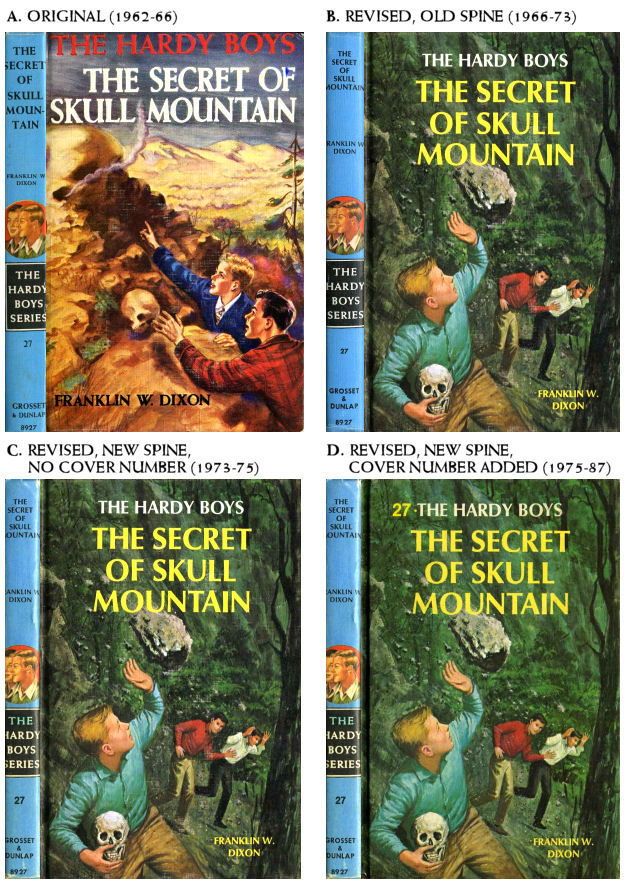
Note that the revision of spine numbers did NOT happen at the same time as the addition of numbers to the covers (discussed on the front cover design page). The spine numbers for volumes 1-51 were replaced around 1973, but cover numbers were not added until around 1975. This gives us three different spine-plus-cover combinations for cloth PCs—or in many cases four, if we count the original edition of volumes 1-38. The four different combinations are illustrated here for volume 27:
- 1973-74: Helvetica numbers. In addition to replacing the original numbers on volumes 1-51, Helvetica numbers were also used on the newly-created spines for volumes 52 and 53.

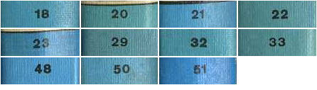
The front cover design for these two volumes was Format 9, which used the Akzidenz-Grotesk typeface (not Helvetica, although it is quite similar). - 1975-79: Large Akzidenz-Grotesk numbers. On volumes 54-58, the spine number was set in Akzidenz-Grotesk rather than Helvetica, thus returning to consistency with the front cover typeface. These numbers were set in a larger point size than the Akzidenz-Grotesk numbers used in 1968-72.
Compare the "8" character in Akzidenz and Helvetica to see the difference—it is slightly wider in Akzidenz:
The spine number in volumes 54-58 also shares this wide-looking 8, confirming that the typeface is Akzidenz rather than Helvetica:

The front cover design for these volumes was format 10, which also used Akzidenz-Grotesk.
5. Variation in the publisher name
The typeface used for "Grosset & Dunlap" at the bottom of the spine underwent less change than the volume numbers. As above, the date ranges refer to the year in which the cover was originally designed, not the year in which it was printed. For example, all covers that were designed in 1962 have the publisher set in Weiss, regardless of the printing date.- 1962-64: Weiss, with "Grosset" larger than "Dunlap". This format was used along with cover format 5, which also used Weiss.

- 1964-65: Weiss, with "Grosset" the same size as "Dunlap". This format was used along with the final few Format 5 covers.

- 1966-67: Univers Condensed. This exceptional format is found only on volume 45 and the revised edition of volume 10. Other covers created in this period used Futura for the publisher (see next item).

- 1966-1979: Futura. The publisher's name was set in Futura throughout the use of cover formats 6-10, which used the Optima and Akzidenz-Grotesk typefaces.

The use of Futura for the publisher's name began in 1966, at the same time as the volume number was switched to Futura. However, while the volume numbers would subsequently be changed (see above), the publisher's name remained in Futura until the end of the series.
6. Variation in the volume code
The volume code, at the very bottom of the spine, has only two major variants.- 1962-68: Futura volume code. Futura appears on spines created from 1962 to 1968. It also exceptionally appears on the spine of the revised edition of volume 36 (1972), well into the Akzidenz era.

- 1968-79: Akzidenz-Grotesk volume code. The volume code switched to Akzidenz-Grotesk at the same time as the front cover design did (cover format #8).

On the revised editions of volumes 28 (1970) and 30 (1968), as well as volume 49 (1970), the typeface is slightly different. It is slightly more condensed and less bold, although it still seems to be a version of Akzidenz. This same variation occurs in the volume numbers for these three volumes, as noted above.

Another different typeface exceptionally appears on the spine of volume 54 (1975):

Laminated "flashlight" spines (1987-present)
Aside from their blue background, the spines introduced with the switch to laminated "flashlight" covers in 1987 are a complete departure from earlier designs. All text is set in a condensed sans-serif font, the new flashlight logo appears at the top of the spine, and with the exception of the volume number, all lettering flows vertically rather than horizontally. Longer titles are broken onto two lines.